A Cholesterol-First Nutrition Experience Focused on Clarity, Not Overload
UX Designer · UI Designer
Figma · Notability · FigJam · Maze
Sept 2024 - Dec 2024
UX/Accessibility

Overview
TrackLDL is a UX-driven health application concept designed to help users understand and manage cholesterol without cognitive overload. The project focused on simplifying nutritional information, prioritising cholesterol as a primary metric, and supporting long-term habit formation through clear feedback and guidance.
Managing cholesterol is essential for preventing heart disease, yet many users struggle to understand and control their intake.
The Health Risk
Uncontrolled cholesterol increases the risk of heart-related conditions.
Lack of Clarity
Users do not always understand the relationship between cholesterol, LDL, HDL, and daily food choices.
Lost in the Numbers
Nutrition apps often present calories, macros, sodium, sugar, fats, and cholesterol together without explaining what users should prioritise.
Cognitive Overload
Most nutrition apps track too many health metrics, causing cognitive overload.
Design Challenge
Design a focused and easy-to-understand cholesterol tracking experience that prioritises clarity over complexity.
Research
A quantitative survey was conducted to understand cholesterol awareness, lifestyle habits, and current management behaviours.

Survey Responses
46 individuals participated in the survey and provided valuable insights into cholesterol awareness, diet, and health-related behaviours.
Key Findings
have little to no understanding of the difference between good and bad cholesterol
(15 out of 46 participants)
follow an unrestricted diet without actively monitoring food intake
(29 out of 46 participants)
never check their cholesterol levels
(15 out of 46 participants)
never check fat or calorie information in their food
(13 out of 46 participants)
are motivated to manage cholesterol to improve overall health
(29 out of 46 participants)
are driven by preventing future health problems rather than managing existing conditions
(28 out of 46 participants)
While awareness and concern around cholesterol exist, proactive tracking and nutritional engagement remain low, highlighting the need for a low-effort, cholesterol-first experience.
Competitive Landscape
Existing tools were analysed to understand how cholesterol is currently represented in nutrition tracking apps.
Analysis Goals
How cholesterol is prioritised within existing tools
Whether educational support is integrated
How complex or beginner-friendly current solutions are

Key Insights
Based on survey responses and research, three key patterns emerged:
Cholesterol awareness exists, but understanding is shallow
While many participants recognise cholesterol as important, a significant portion lack clarity on how it relates to daily food choices.
Nutrition tracking feels overwhelming
Users are discouraged by apps that track too many metrics, making it difficult to focus on actionable health decisions.
Motivation is preventative, not reactive
Most users are driven by avoiding future health risks rather than managing existing conditions.
Features
Based on the identified insights, features were designed to reduce complexity and improve decision-making.
Cholesterol-Focused Dashboard
Tracks saturated fat, salt, and sugar as key dietary factors linked to cholesterol health.
Meal Logging (Barcode + Image Recognition)
Log meals instantly using barcode scanning or image recognition, reducing manual effort and making tracking easier.
Low LDL Impact Recipe Suggestions
Recommends healthy meals and alternatives tailored to users' nutritional intake.
Simplified Educational Layer
Explains cholesterol and key dietary factors in plain language to support informed food choices.
Personas
Prevention-Focused User
Age 35–50 · Proactive
Motivated by preventive health
Limited practical cholesterol knowledge
Finds nutrition apps overwhelming
Needs clear, everyday guidance
Low-Effort Tracker
Age 25–40 · Reactive
Rarely checks cholesterol or nutrition labels
Unrestricted eating habits
Inconsistent food tracking
Needs quick, low-effort logging
Design Evolutions
Low-fidelity sketches were used to explore core design decisions before moving into wireframes and high-fidelity UI. The focus was on improving navigation clarity, simplifying cholesterol-related information, and reducing effort in food logging.
Navigation Structure
Problem
Users needed quick access to core actions without overwhelming the bottom navigation.
Exploration
Two navigation structures were tested, comparing five visible actions against a simplified four-action layout.
Outcome
Users preferred Version A, reporting that its simplified layout was easier to understand at a glance.

Dashboard Hierarchy
Problem
Users struggled to identify which metrics directly impacted LDL cholesterol.
Exploration
Multiple dashboard concepts explored different ways of presenting cholesterol, sodium, and saturated fat information.
Outcome
Initial testing led to a cholesterol-first hierarchy, with supporting health metrics presented as secondary information.
Early Sketch

Wireframe

Final UI

Food Logging
Problem
Manual food logging can be repetitive and time-consuming, making consistent tracking difficult.
Exploration
Several meal logging methods were explored, including manual entry, image recognition, and barcode scanning, to reduce everyday tracking effort.
Outcome
The final design offered multiple logging methods, giving users the flexibility to choose the approach that best suited their needs.
Early Sketch

Wireframe

Final UI

Validation & Iteration
The prototype was evaluated with five participants using Maze, think-aloud testing, post-test interviews, and SUS scoring to identify usability issues around navigation clarity, dashboard comprehension, and food logging before refining the final interface.
Participants
5
Method
Maze Usability Test
Tasks
Recipe, Food Logging, Education
Feedback
Think-aloud + Post-test
Measure
SUS Questionnaire
Users were generally able to complete the core tasks, but testing revealed friction around unclear navigation labels, difficulty interpreting dashboard metrics, and unnecessary effort in the food logging flow.
1
Navigation Clarity
Finding
Users could not understand some navigation items
Evidence
"The nav bars has no labels?" / "Challenging without the icon labels."
Change
Labels were added to the navigation bar and icon hierarchy was refined.
Impact
Improved recognition of Home, Recipe, Education, and Settings.
Before

After

2
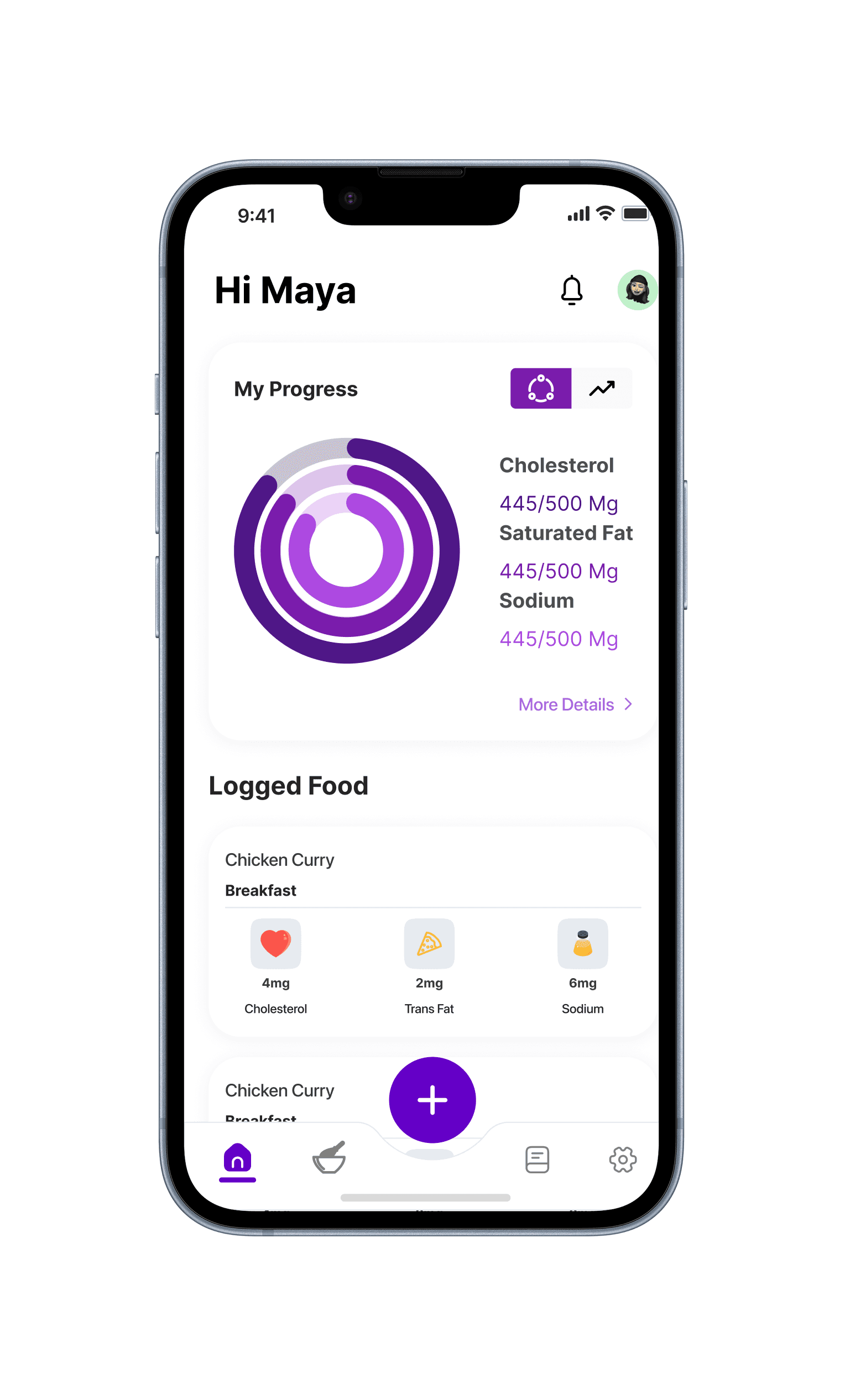
Dashboard Hierarchy & Macro Rethink
Finding
Users struggled to understand which metrics directly affected LDL cholesterol.
Evidence
"Too much and confusing, difficult to understand which metric belonged where."
Change
Key cholesterol-related metrics were supported with colour-coded indicators and explanatory tooltips to improve comprehension.
Impact
Dashboard was easier to scan and better aligned with how diet realistically supports cholesterol management.
Before
After
Further research showed that cholesterol requires medical testing. The dashboard therefore prioritised trackable dietary factors, including saturated fat, sugar, and sodium, to support more actionable food choices.
Before

After

3
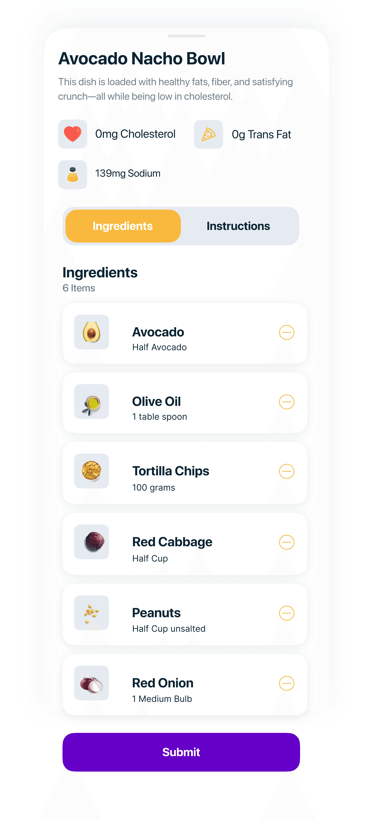
Recipe Recovery
Finding
Users had difficulty restoring previously removed ingredients during recipe customisation.
Evidence
Participants reported that removed ingredients could not be easily recovered without restarting the process.
Change
Introduced a "Removed Items" section that allows users to quickly restore deleted ingredients.
Impact
Improved user control and reduced the need to repeat actions, making recipe editing more efficient.
Before
After

Measuring the Impact
Initial SUS Score
76.5
Final SUS Score
86.5
After addressing navigation clarity, dashboard comprehension, and recipe recovery usability issues, the SUS score improved from 76.5 to 86.5.
Accessibility & UX Thinking
Visual Accessibility
Sufficient colour contrast across UI elements
Clear visual hierarchy and iconography
Large touch targets for easy interaction
Reducing Cognitive Load
Plain language over medical jargon
Progressive disclosure to reduce information overload
Visual cues over text-heavy explanations
Low-Effort Design
Reduced manual data entry
Forgiving error handling and easy corrections
Inclusive Health Focus
Non-judgmental language around food choices
Focuses on building healthy habits, not guilt-driven tracking
Celebrates progress without shaming setbacks
Refined Solution
After validating and iterating the prototype, the final solution focused on helping users understand, monitor, and act on dietary factors that influence LDL cholesterol.
DASHBOARD
Displays sugar, saturated fat, and sodium as trackable dietary factors, helping users monitor habits linked to cholesterol health.

Dashboard

FOOD LOGGING
Users can log meals manually, through image recognition, or by scanning a barcode, choosing the method that best fits their situation.
RECIPES
Recipes show ingredients, nutritional indicators, and healthier alternatives to support better food choices.


EDUCATION
Bite-sized educational content that helps users understand cholesterol and make informed food choices.
Explore the prototype
The interactive prototype connects the dashboard, food logging, recipe, and education flows.
Reflection
What I learned
Designing for health isn't just about presenting data, it's about helping users make informed decisions. Prioritising actionable insights over complex metrics significantly improved usability and comprehension.
Future Opportunities
Explore integration with wearable and health data platforms
Validate long-term engagement through longitudinal testing