An accessibility-first sketching experience focused on creativity, not barriers.
UX Designer · UI Designer
Figma · MS Forms · Notability
Jan 2025 - April 2025
UX/Accessibility

Overview
OpenCanvas is an accessible digital sketching platform designed to reduce barriers in creative software for users with physical, cognitive, auditory, and visual impairments. The project reimagines common creative workflows such as tool selection, layer management, colour selection, tutorials, and focus support through an accessibility-first design approach.
The Challenge
Creative software often relies on precise interactions, colour-coded information, audio-based guidance, and complex interfaces that may not be accessible to everyone.
My Approach
I translated accessibility barriers into targeted design interventions, guided by relevant WCAG 2.2 success criteria, and evaluated the prototype through usability testing.
The Outcome
A multi-platform sketching experience designed around diverse access needs from navigation and colour selection to learning, focus, and error recovery.
Drawing applications often depend on precise input, colour-based information, gestures, and visual instruction interactions that can create barriers for people with motor, visual, or cognitive access needs.
I wanted to explore how accessibility could become part of the creative workflow itself rather than an additional settings layer added later in development.

Accessibility in creative tools remains underexplored
Creative workflows contain multiple accessibility barriers
Inclusive design should support creativity without reducing capability
Digital drawing tools can rely on precise pointer movements, colour-coded feedback, audio-led tutorials and dense interfaces. This project explored how these patterns can create barriers across four areas of access.

Motor Accessibility
Creative tools often rely on precise interactions, making certain actions difficult to perform consistently.

Visual Accessibility
Important information is frequently communicated through visual elements that may not be accessible to everyone.

Auditory Accessibility
Learning materials and system feedback can depend heavily on audio-based communication.

Cognitive Accessibility
Complex interfaces and inconsistent feedback can increase effort and reduce task focus.
#1
Provide flexible ways to interact
#2
Communicate information in multiple ways
#3
Keep the workspace focused and predictable
To guide design decisions, I created four research-informed proto-personas, each focused on one accessibility area addressed by the platform.
Alex
Early-stage Parkinson's Disease
Need
Better support for selecting tools and managing layers.
BARRIER
Tremors, stiffness, and difficulty with small targets.
OPPORTUNITY
Larger targets, keyboard access, alternative layer movement.
Mia
Complete Hearing Loss
Need
Learn creative techniques without relying on audio.
BARRIER
Audio-dependent tutorials, and cues
OPPORTUNITY
Captions, transcripts, visual guidance.
Ethan
ADHD
Need
Stay focused and avoid mistakes.
BARRIER
Distractions, time blindness, cognitive overload.
OPPORTUNITY
Focus Mode, timers, feedback, confirmation patterns.
Sophia
Deuteranopia
Need
Identify and select colors confidently.
BARRIER
Difficulty distinguishing red and green.
OPPORTUNITY
Patterns, labels, and text-based confirmation.
These proto-personas were informed by secondary research and accessibility guidance and used to guide design decisions throughout the project.
Before developing high-fidelity designs, I explored how accessibility challenges within digital sketching could inform interface decisions. Each concept investigated a different opportunity to make creative workflows more inclusive.
01
Accessible Tool Selection
Focus Visible(2.4.7)
Target Size Enhanced(2.5.5)
Keyboard Access(2.1.1)
On Focus(3.2.1)
Early Exploration


What was explored
Larger toolbar targets
Visible focus states
Enter-to-confirm activation
Design Decision
Tool selection moved from small icon-only controls to a keyboard-supported toolbar with visible focus and larger icons with intentional activation.
High Fidelity
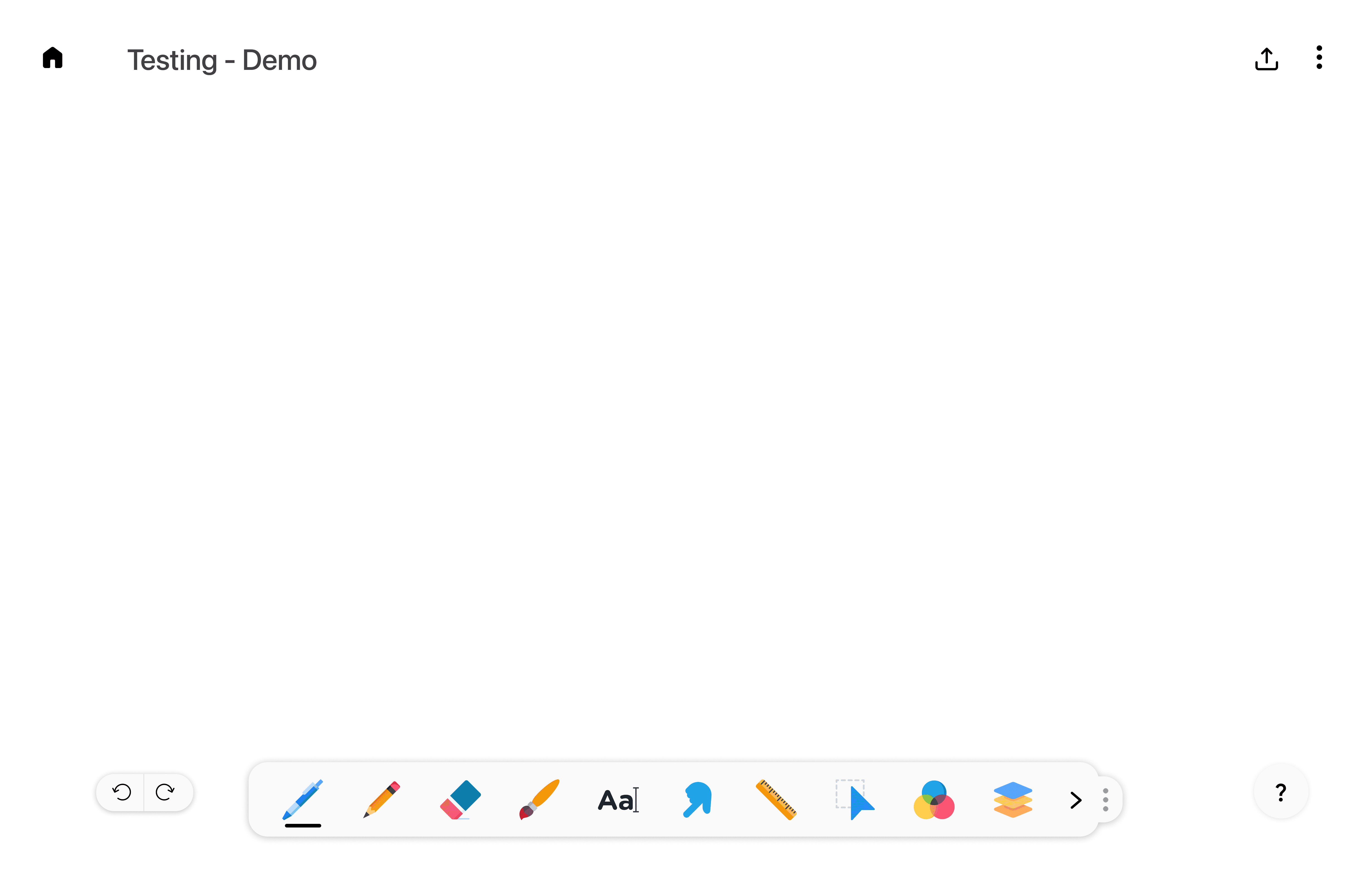
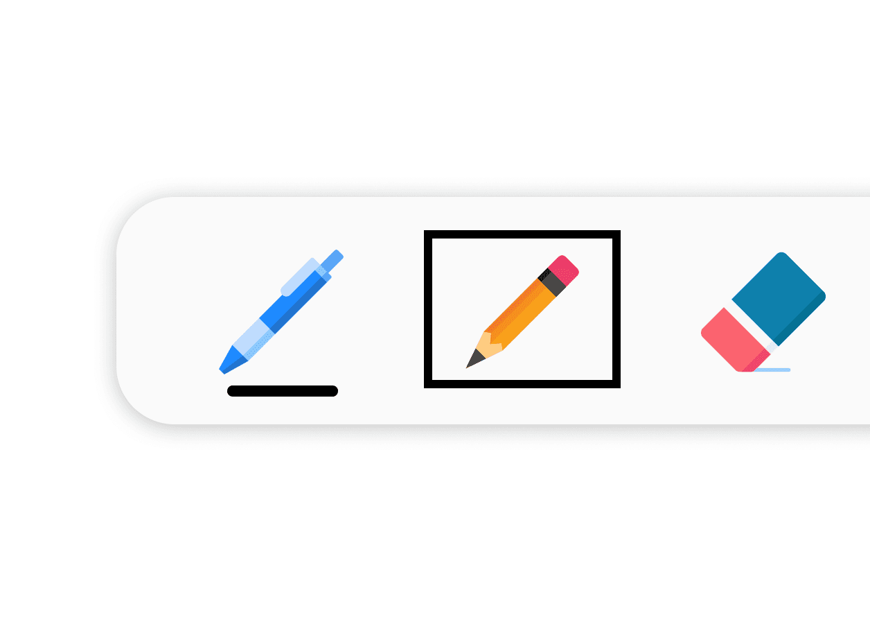
Final Features
Larger Targets
Visible focus states
Keyboard-supported selection
Intentional activation
Why it mattered
Small icon-only toolbars can create barriers for users with tremors, stiffness, limited fine motor control, or keyboard-only navigation needs. The final toolbar makes tool selection easier to target, easier to track visually, and safer to activate intentionally.
02
Layer Management Without Drag and Drop
Keyboard Access(2.1.1)
Dragging Movements(2.5.7)
Focus Visible(2.4.7)
Focus Order(2.4.3)
Early Exploration

What was explored
Keyboard navigation between layers
Shortcut-based layer movement
Arrow-key control
Visible selected layer states
Alternatives to drag-and-drop
Design Decision
Layer management was redesigned around focus, shortcuts, and step-by-step keyboard-supported controls instead of relying only on dragging.
High Fidelity

Keyboard shortcut initiates layer movement without drag-and-drop.

Visible focus indicates the currently selected layer while arrow keys reposition it.

An insertion indicator previews the new position before confirming with Enter.
Final Features
Keyboard-supported reordering
Visible layer focus
Insertion-position preview
Enter to confirm
Why it mattered
Dragging layers requires steady pointer control and precision. A keyboard-supported layer system gives users a more forgiving way to organise their canvas without depending on drag-and-drop alone.
03
Colour Selection Beyond Colour Alone
Use of Colour(1.4.1)
Early Exploration
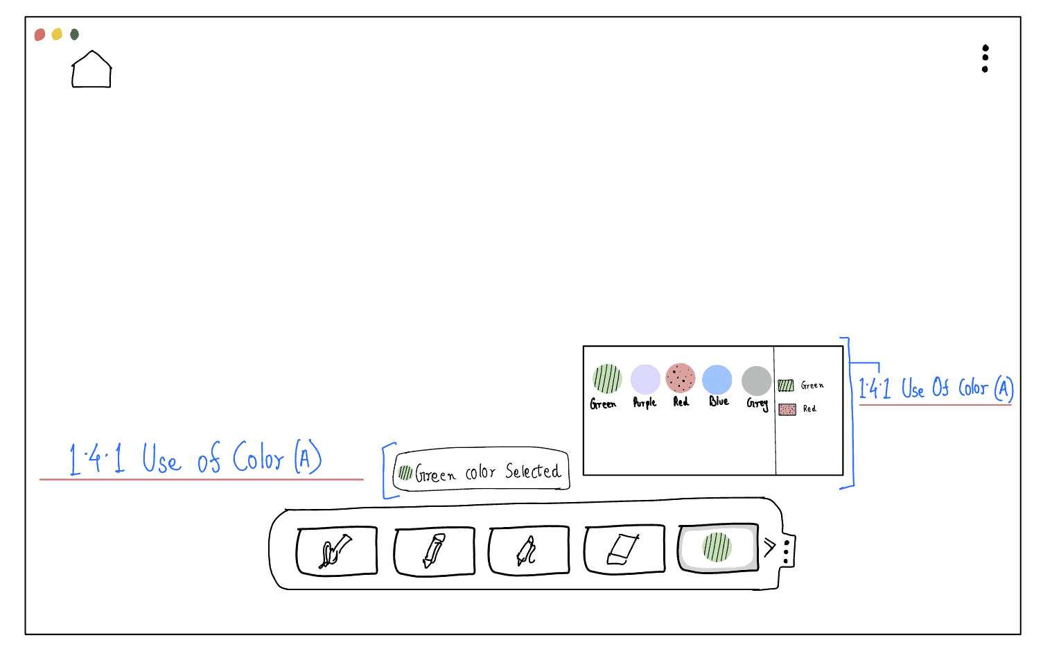
What was explored
Pattern-based colour cues
Selected colour confirmation
Support for colour vision differences
Design Decision
Colour selection was redesigned to provide multiple confirmation cues, combining colour names, patterns, and explicit feedback to reduce reliance on colour perception alone.
High Fidelity

Final Features
Text colour labels
Pattern-based cues
Explicit selection feedback
Why it mattered
Users with colour vision deficiencies may struggle to distinguish similar colours or confirm their selection. Pairing colour with text labels, patterns, and clear feedback reduced reliance on colour perception alone when identifying and confirming a selection
04
Accessible Tutorial and Guidance
Non-Text Content (1.1.1)
Consistent Navigation (3.2.3)
Contrast Minimum (1.4.3)
Captions (Prerecorded) (1.2.2)
Early Exploration

What was explored
Tutorial cards with clear titles
Captioned video guidance
Transcript support
Readable caption overlays
Design Decision
Tutorial guidance was designed to support learning through text, captions, transcripts, and predictable navigation instead of relying only on audio or visual demonstration.
High Fidelity


Final Features
Captions
Transcripts
Readable Caption Contrast
Why it mattered
Captions, transcripts, and clear labels make tutorials accessible without relying solely on audio.
05
Focus and Task Completion
Headings and Labels (2.4.6)
Labels and Instructions (3.3.2)
Timing Adjustable (2.2.1)
Early Exploration
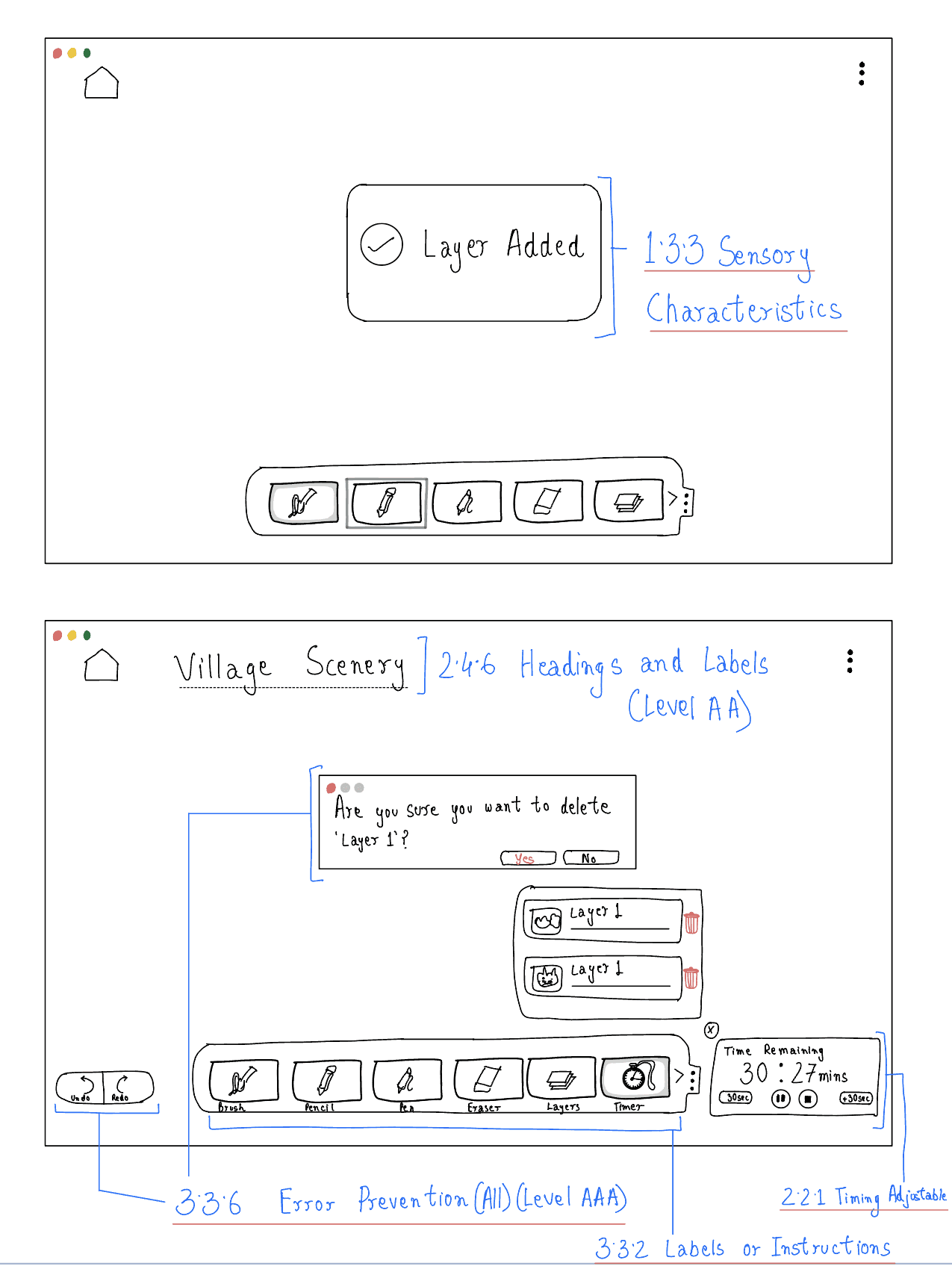
What was explored
A reduced-distraction Focus Mode
Adjustable focus and break timers
A persistent project title
Clear names for drawing tools
Visible feedback after completing an action
Design Decision
Focus Mode was designed to reduce interface clutter while preserving the context, controls and feedback users need to complete their work.
High Fidelity


Final Features
Action confirmation
Distraction-reduced workspace
User-controlled focus timer
Why it mattered
Users with attention-related difficulties may become overwhelmed by dense controls, lose track of their current task, or struggle with rigid working sessions. A simplified workspace, flexible timing, persistent context, and clear feedback help users remain focused and work at a manageable pace.
Rather than shrinking a desktop interface onto smaller screens, I adapted accessibility patterns to each platform.
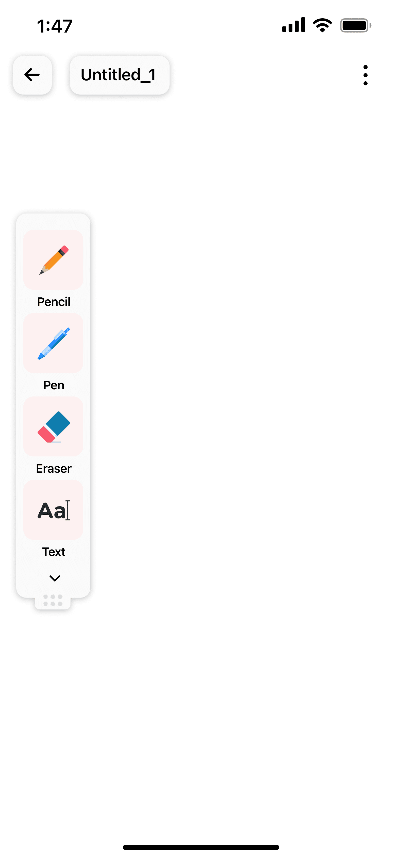
Mobile
Controls within easier reach
The desktop toolbar was adapted into a vertical mobile control strip with larger, clearly separated touch targets. Explored left- and right-side toolbar placement so controls could remain closer to the user’s preferred hand instead of enforcing one fixed position.

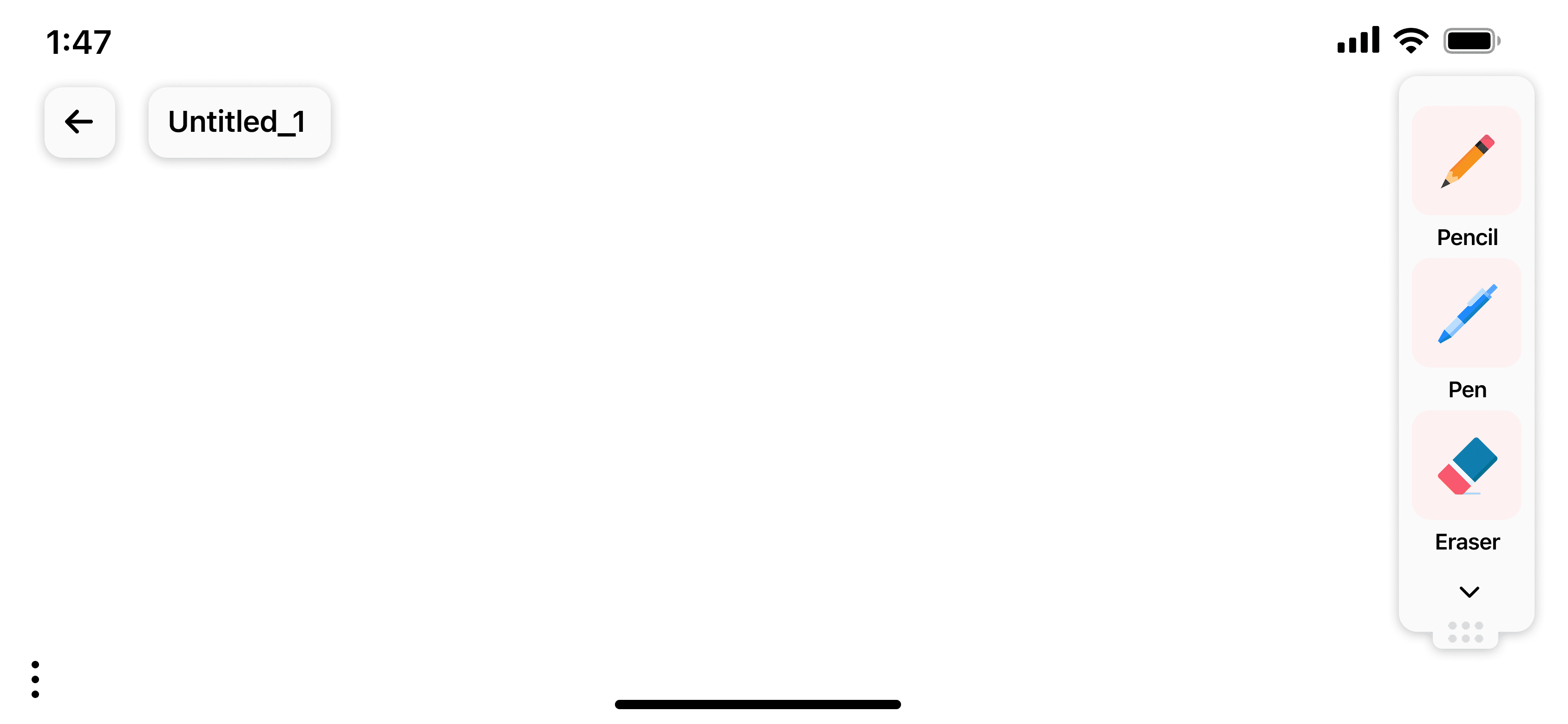
Preserving access when orientation changes
In landscape orientation, the toolbar remained attached to the side of the interface, giving the canvas more horizontal space while keeping the main tools visible and reachable. This prevented the mobile layout from simply stretching or overlapping controls when the device was rotated.
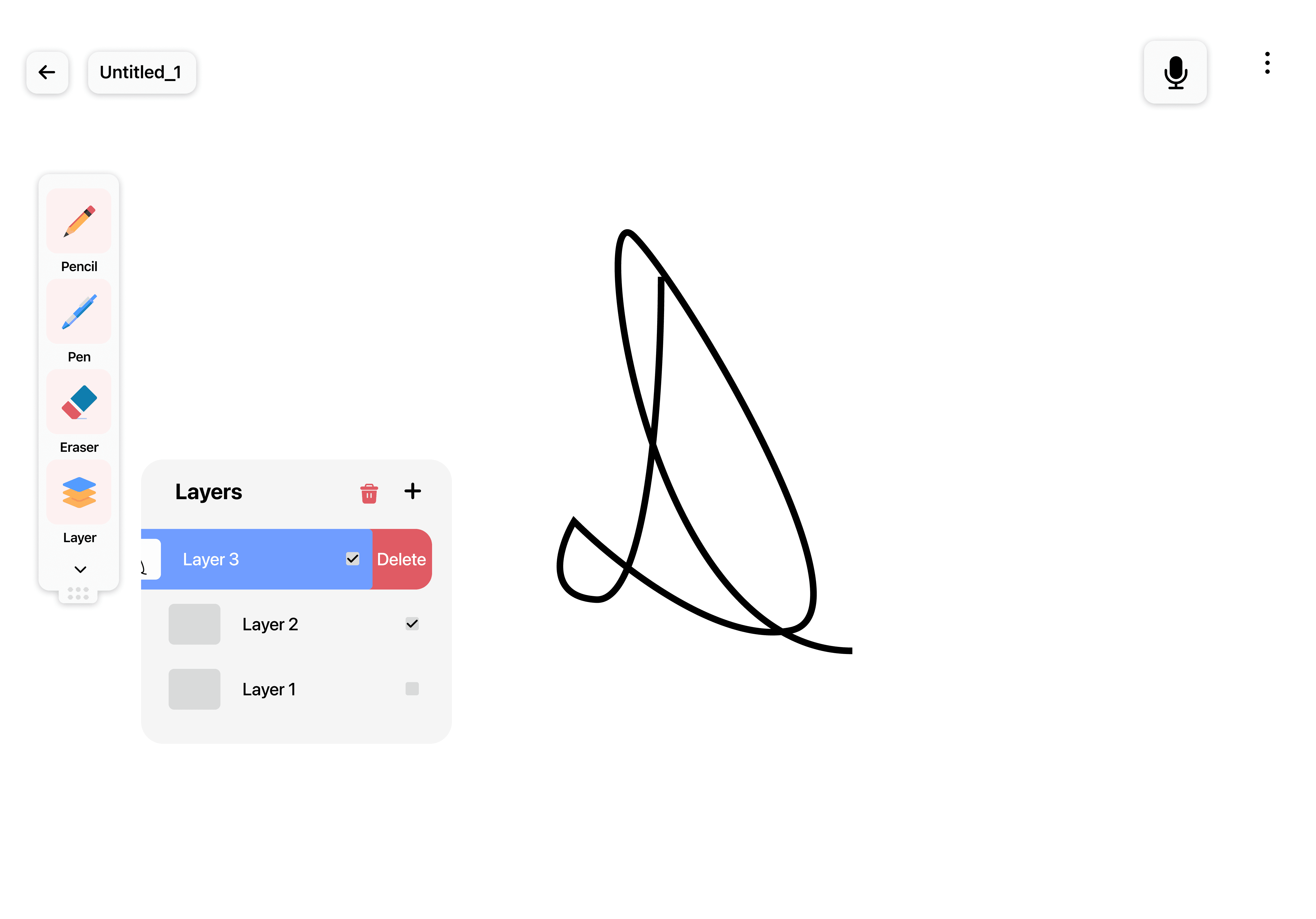
Tablet
Providing alternatives to precise touch
The tablet concept explored voice commands as an alternative to precise touch input. Layer deletion could be completed through either a swipe gesture or the Edit menu, preventing reliance on a single interaction method.


I conducted task-based usability testing followed by a System Usability Scale (SUS) survey and short post-test interviews.
Participants
5
Students, designer, working professional
Methods
Task Based Usability Testing
SUS Survey
Post-Test Interviews
6 Core Tasks
Select Pencil using keyboard
Select Green color
Move Layer using Keyboard
Delete layer
Access Tutorial
Enable Focus Mode
Testing focused on usability and accessibility-oriented interactions. Participants did not have disabilities.
Key Insights from Testing
01
Keyboard interactions were usable but required clearer guidance
Participants completed tool selection and navigation with minimal friction using keyboard controls.
02
Multiple cues clarified colour-selection feedback
Participants understood the selected colour through the combination of text labels, patterns and confirmation feedback.
03
Move Layer required more explicit guidance
Participants looked for contextual help when they could not remember how to enter Move Layer mode.
Iterations Based on Testing
1
Help & Tutorial Clarity
Finding
Users could not distinguish between Tutorial and Help when both were presented as a single menu item.
Evidence
Participants seeking guidance for Move Layer selected “Tutorials/Help” but were taken to general tutorial content rather than contextual instructions.
Change
Separated the two functions. Tutorials remained in the menu with a video icon, while Help became a persistent button providing contextual guidance and keyboard shortcuts.
Impact
Separating the two functions made structured tutorials and contextual help easier to distinguish and locate.
Before

A combined “Tutorials/Help” entry made the type of support unclear.
After

Separate entry points distinguish structured tutorials from contextual help.
Measuring the Impact
Initial SUS Score
77.5
Final SUS Score
87.5
After addressing key usability issues, including unclear Help and Tutorial pathways, the SUS score increased from 77.5 to 87.5.
After developing the accessibility concepts through sketches and evaluating the interactive prototype, I refined them into a high-fidelity desktop experience.

Workspace Overview
The final interface keeps the drawing workspace uncluttered while ensuring accessibility features remain easily accessible throughout the creative process.
Colour Guidance
Colour choices are supported with labels, patterns, and confirmation feedback so selection does not rely on colour alone.
Accessible Learning
Tutorials include captions and a transcript so learning is not dependent on audio alone.
Error Prevention
Destructive actions include confirmation prompts, allowing users to reconsider before permanently deleting content.

Focus Support
Focus mode uses a visible timer and adjustable controls to help users structure drawing sessions.
Limitations
Small sample size of five participants limits generalisability
No disabled participants were included in usability testing
The prototype evaluation did not assess use with assistive technologies
Next Steps
Conduct usability testing with participants with disabilities
Improve onboarding for less-discoverable interactions
Further evaluate and refine mobile accessibility patterns
Reflection
What I learned
OpenCanvas taught me that accessibility is most effective when built into core interactions rather than isolated within a settings layer. It also clarified the limits of guideline-led design: WCAG can help identify potential barriers, but it does not replace co-design and testing with disabled people. In a future iteration, I would involve disabled artists earlier and evaluate the implemented experience with assistive technologies across devices.
Future Opportunities
Inclusive testing with disabled artists
Real-device mobile and tablet testing